Reels Caption Fonts, Size and Safe Zones for Mobile
One font, one size, one safe area. Here's a caption preset for 1080x1920 Reels and Shorts that stays readable and never hides behind the app interface.
In this article
For Reels caption fonts, size and safe zone, use a bold, plain sans-serif such as Montserrat, Poppins or Inter Bold at about 42 px or larger on a 1080x1920 frame. Keep every line inside the center safe zone, clear of the top and bottom ~250 px, and leave even more room at the bottom on Reels, where the interface covers text.
That's the whole preset in one breath. The rest is how to apply it and how to check it.
The short answer: the best caption font, size and safe zone
The best font for Reels captions is a bold or semi-bold sans-serif, because it stays readable at thumb-scroll speed on a small screen. Pair it with a size of 42 px or more, two lines at most, strong contrast, and a position in the middle of the frame.
Every number here is a working guideline, not a platform law. Sources disagree and the apps change their layouts. Check the current official guide before you lock a template.
Best fonts for Reels captions
Font weight matters more than font name: heavy strokes survive compression, motion and bright backgrounds, while thin ones break up.
Fonts that work: bold sans-serifs
Montserrat Bold, Poppins SemiBold or Bold and Inter Bold all do the job. Their letters are open, evenly spaced and clear at a glance. Pick one and stay with it across every video so your page looks consistent.
Fonts to avoid: script, thin and decorative styles
Decorative fonts are the most common mistake we see in burned-in captions. Script, handwriting, ultra-thin and ornate styles look great in the editor and fall apart on a phone in sunlight. Viewers who squint scroll away. Save style for your cover, not your subtitles.
Caption size for Reels on a 1080x1920 frame
Treat 42 px as the floor for caption size on a 1080x1920 canvas, and go larger for hook lines. In our own work, 48 to 64 px reads comfortably without crowding the frame.
Keep it to two lines maximum, with roughly three to five words per line. If a sentence needs three lines, split it into two caption chunks that change on the beat of the speech. Short chunks also support retention, since the eye always has something new to read.
Color contrast: making captions readable on any background
Captions need contrast against every frame, not just the first one. The safest combination is white or light yellow text with a dark outline or soft shadow, or a semi-transparent dark box behind the words.
Pick one treatment and test it on your brightest and busiest shots. Light text with no outline vanishes over sky and snow. Dark text with no box vanishes over night footage. A thin outline of a few pixels usually solves both.
Reels safe zone: where captions can and can't go
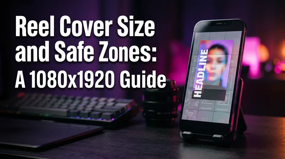
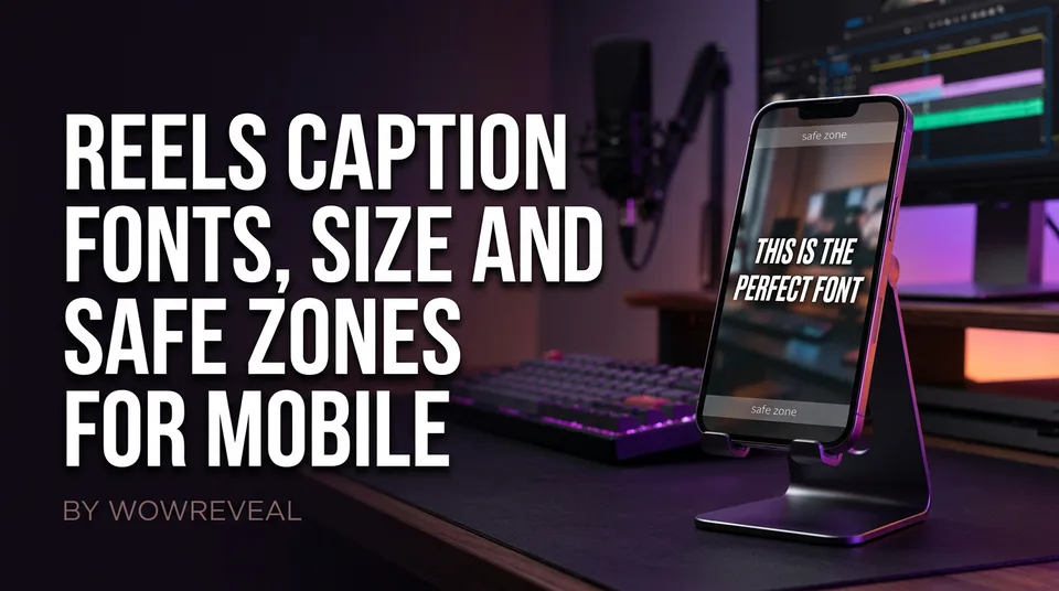
The safe zone is the center of the frame, where the app's interface never covers your text. Meta explains the idea in its help page on text overlays and the safe zone, and it applies to Facebook Reels and Instagram Reels alike.
Top and bottom danger areas
Keep text out of the top and bottom ~250 px of the 9:16 frame. On Reels the bottom needs more, since the account name, caption text and audio label stack there. Some creators report closer to 320 px once the caption expands, so treat 250 px as the minimum and add margin below.
Right-side buttons and the caption area
Like, comment, share and audio buttons sit along the right edge. Leave a clear margin there, and center-align your lines so they don't drift under the icons. If you need a template, a transparent PNG overlay at 1080x1920 with these margins marked works in any editor.
Caption position for Shorts and TikTok
One conservative safe area works on every platform: center-aligned text in the middle third of the frame, slightly above true center. The overlap zones differ in detail, but they sit in the same places.
| Platform | What covers the frame |
|---|---|
| Instagram Reels / Facebook Reels | Bottom caption, account and audio; right-side buttons |
| YouTube Shorts | Bottom title and channel info; right-side buttons |
| TikTok | Bottom caption and sound label; right-side buttons |
Design for the strictest one and you can post the same file everywhere.
How to test your captions on a phone before posting
Test on a real phone, because the editor preview hides the interface that causes most problems. Export the video, then run three checks.
- Play it with the app's interface on, using a private draft or a test upload, and look for any text touched by buttons or captions.
- Hold the phone at arm's length. If you can't read the caption in one glance, it's too small or too thin.
- Watch the uploaded version, not the export. Compression softens thin outlines and small text.
A reusable caption preset
A preset removes the decision-making from daily posting. Here's the one we'd start from:
- Font: Montserrat, Poppins or Inter, bold or semi-bold
- Size: 42 px minimum, larger for hooks
- Lines: two maximum, three to five words each
- Contrast: light text with dark outline, shadow or box
- Position: centered, middle third, out of the top and bottom ~250 px and away from the right edge
Save it once. WowReveal's animated captions let you keep a style like this across every render, so you aren't rebuilding it each time.
Frequently asked questions
What font size should I use for Instagram videos?
Use about 42 px or larger on a 1080x1920 frame, and go bigger for hook lines. Anything smaller gets hard to read on a phone screen.
What is the safe zone for text on Instagram Reels?
Keep text in the center of the frame, out of the top and bottom ~250 px, with extra room at the bottom and away from the right-side buttons. Numbers vary by source, so check Meta's current guide.
Can I use one safe area for Reels, Shorts and TikTok?
Yes. Center your text in the middle third and respect the strictest margins, which are the Reels bottom and the right-side buttons. That layout works on all three.
Where to go next
- Burned-In Captions vs Closed Captions: What's the Difference? — Explains why safe zones matter when text is baked into the video.
- What Is the 9:16 Aspect Ratio? Definition, Size and Use — Covers the 1080x1920 canvas these safe-zone values are built on.
- How to Add Animated Captions to a Reel, Step by Step — The next step: apply these settings to a real video.
- Animated Captions for Shorts and Reels: Styles, Settings and Mistakes to Avoid — A wider guide to caption styles and settings.
- Short Video Retention: How to Get Reels and Shorts Watched to the End — Shows where readable captions fit in the retention system.
Generate your reel right now
Paste a link to any video — WowReveal writes the story, voices it and adds captions, a headline and music. Ready for Reels, Shorts and TikTok.
No link? Upload a file
- 30 free credits
- No card needed
- Voiceover in 9 languages
- Failed jobs refunded